Shading, when and where to use it.
There are two methods to apply shading, linear or stippled. Stippling is shading by use of small dots. It is most often applied by hand. When done on computer it does not produce a natural look but rather a repeated pattern of dots. Applying stippling to a set of drawings by hand is time consuming and therefore more costly than linear shading. Rather than cost, subject matter, determines which shading is best. Stippling and straight line shading are permitted on the same object to show contrast but should not be used on the same surface.
Linear shading is by far the most commonly used form of shading and can be applied by hand or on computer.
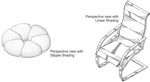
Linear shading comes in three forms.
- Bold Lines emphasize the edge or side of an object that is in shade.
- Thin Lines show the edge or side of an object facing light.
- Thin lines are also used when two objects merge.
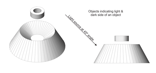
The rule of light coming from the upper left-hand corner at a 45º angle should be applied to shading for all patent drawings. This results in showing objects with the top left side lighter and bottom right side darker. For openings, the opposite applies. Transparent surfaces are indicated by way of slanted strokes. These strokes should not cross the entire surface in one stroke.
Shading should never be too crowded, meaning lines too close or stippling too heavy. If it’s not clear and sharp enough it will not reproduce properly. The general rule is to use as little shading as practical. Gray scale areas are not permitted and Solid black areas are not permitted except when used to represent bar graphs or color.
For Design Patent Drawings the USPTO requires all surfaces of an object shown in the drawings to be appropriately and adequately shaded: “Shading which shows clearly the character and contour of all surfaces of any three-dimensional aspect of the design1”. This requirement makes USPTO design drawings appear more artistic than those of most other countries. Drawings without shading or broken lines resemble engineering or technical drawings (but without dimensions, hidden lines, center lines, etc.)
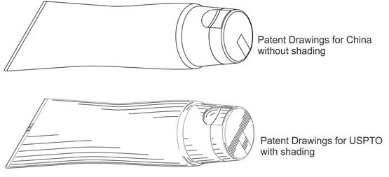
In a design patent application, surface shading directly relates to clarity. A common example is the understanding of complex curvature in a shape. This can be greatly improved with proper shading and contour lines. Without shading the drawings will often be completely unclear and nearly impossible to understand.
Proper application of various shading techniques fulfills two goals. First, they will help the examiner understand and hopefully approve your patent. Second, they help make your invention clearer and unambiguous, should your patent be challenged or infringed upon.
Let’s discuss some specific areas where shading can make all the difference.
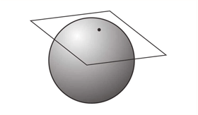
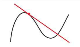
A common area is tangencies. This is a line, curve or surface that touches another curve or surface but does not cross or intersect it.
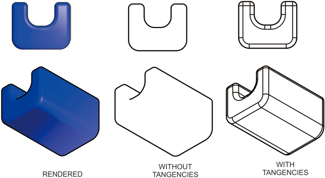
Visually tangential edges are where two surfaces flow into each other. Put another way, it’s when the surface of an object changes its character. Visually they do not appear to have definite edges and in line drawings they are a part of surface shading.
Showing tangential edges may be the only way an examiner can understand the shape of an item.
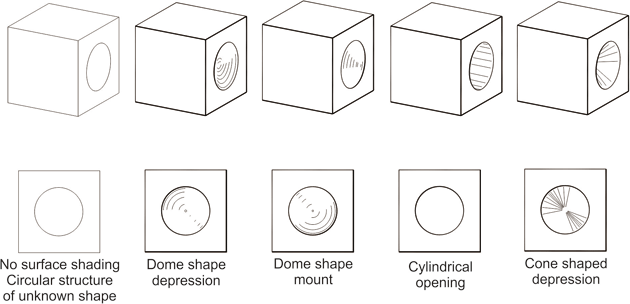
Bold lines are a part of surface shading and are used to emphasize openings, indentations, raised areas and the shadow side of an object.
Without shading you cannot tell if a surface is raised, indented or hollow.
Shading is not always an available tool. In some countries, like China, patent drawings with shading are not permitted, however contour lines are required.
Conclusion
Surface shading is not required in all patent drawings, but including it when permitted will help to clarify the shape of an item. Regardless of where a patent is filled, good drawings make for good applications and for good defenses.
Endnotes
- United States Patent and Trademark Office – A guide to filing a Design Patent application, (5) Surface Shading and Drafting Symbols, Surface Shading.

